American Furniture Color Inspiration: From New England Autumn to California Sunset

Introduction
Part One: New England Autumn — The Palette of Reflection
There is a week in October, across Vermont, New Hampshire, and western Massachusetts, when the world seems to catch fire. The green canopy of summer transforms into a cathedral of color: crimsons, burnt oranges, amber golds, and deep russet browns. It is a fleeting spectacle, but its influence on American furniture design is perennial.
Thank you for reading this post, don't forget to subscribe!The Colors of the New England Woods
| Color | Inspiration | Furniture Application |
|---|---|---|
| Crimson | Maple leaves at peak | Velvet accent chairs, tufted ottomans |
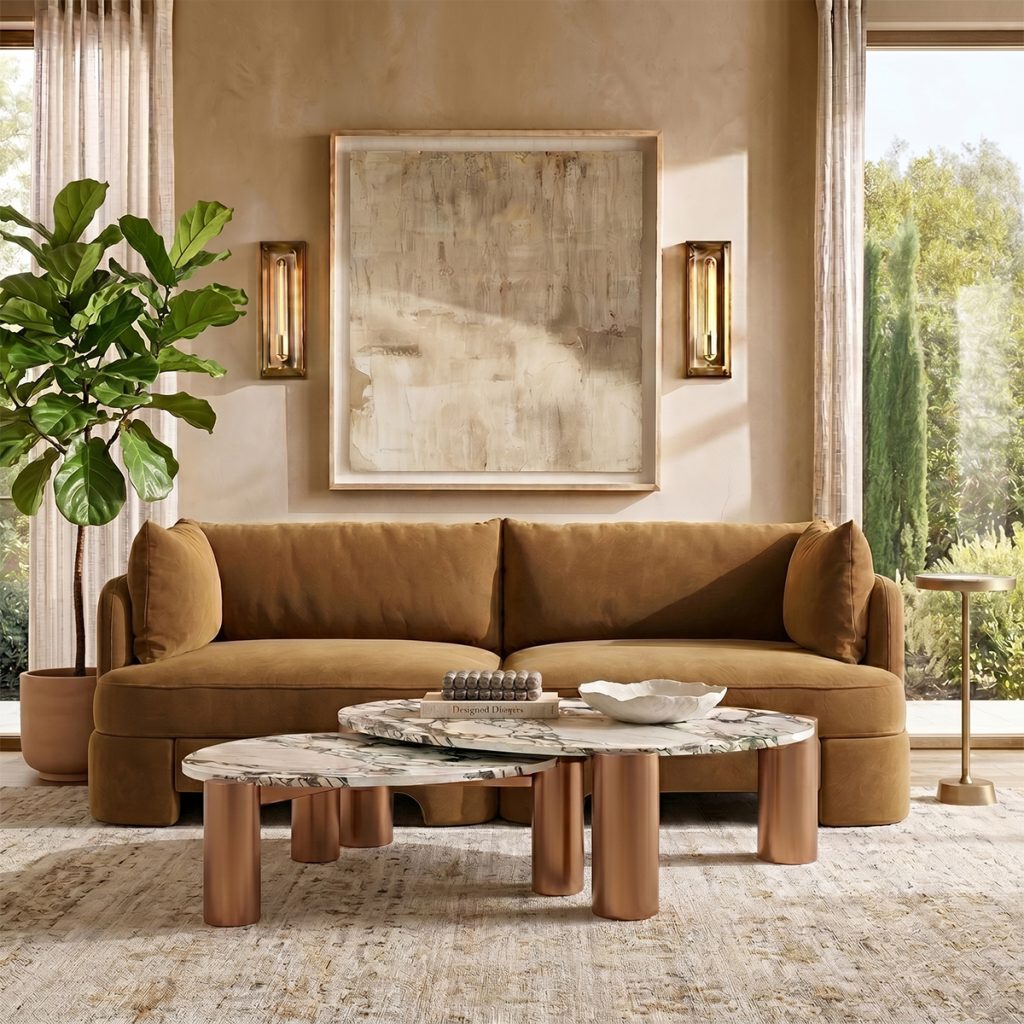
| Burnt Orange | Oak and birch foliage | Leather sofas, woven throws |
| Amber Gold | Late-afternoon light through trees | Wood stains, brass hardware, velvet pillows |
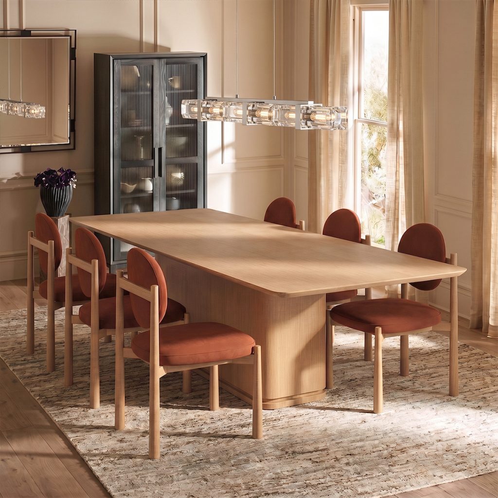
| Russet Brown | Fallen leaves and bark | Leather club chairs, oak tabletops |
| Evergreen | Pines standing firm amid the color | Upholstery, painted cabinets, wainscoting |
The Feeling: Cozy Contemplation
Furniture inspired by New England autumn is not loud. It is rich. It wraps a room in warmth without shouting. A crimson velvet wingback chair by the fireplace, a burnt orange leather sofa that invites an afternoon nap, an amber-washed oak dining table where family gathers for Thanksgiving — these pieces do not demand attention. They earn it, slowly, the way the leaves earn their color after a long summer.
Pairing Suggestions
Crimson + Navy – A classic American combination. The warmth of crimson balances the cool depth of navy.
Burnt Orange + Olive – Earthy, grounded, and deeply inviting. Ideal for a library or study.
Amber + Cream – Light and luminous. Perfect for a breakfast nook or sunroom.
Russet + Charcoal – Sophisticated and masculine. Works well in a city apartment or loft.
Part Two: California Sunset — The Palette of Dreams
Drive west on any coastal highway in Southern California as the day ends, and you will witness something that feels almost manufactured for Instagram — except it is entirely real. The sky ignites in shades of coral, blush, lavender, and soft peach. The Pacific Ocean turns to liquid gold. And for twenty glorious minutes, the world is washed in a light that is both energizing and serene.
The Colors of the Pacific Coast Sky
| Color | Inspiration | Furniture Application |
|---|---|---|
| Coral | The horizon at the moment the sun touches the sea | Performance fabric sofas, outdoor cushions |
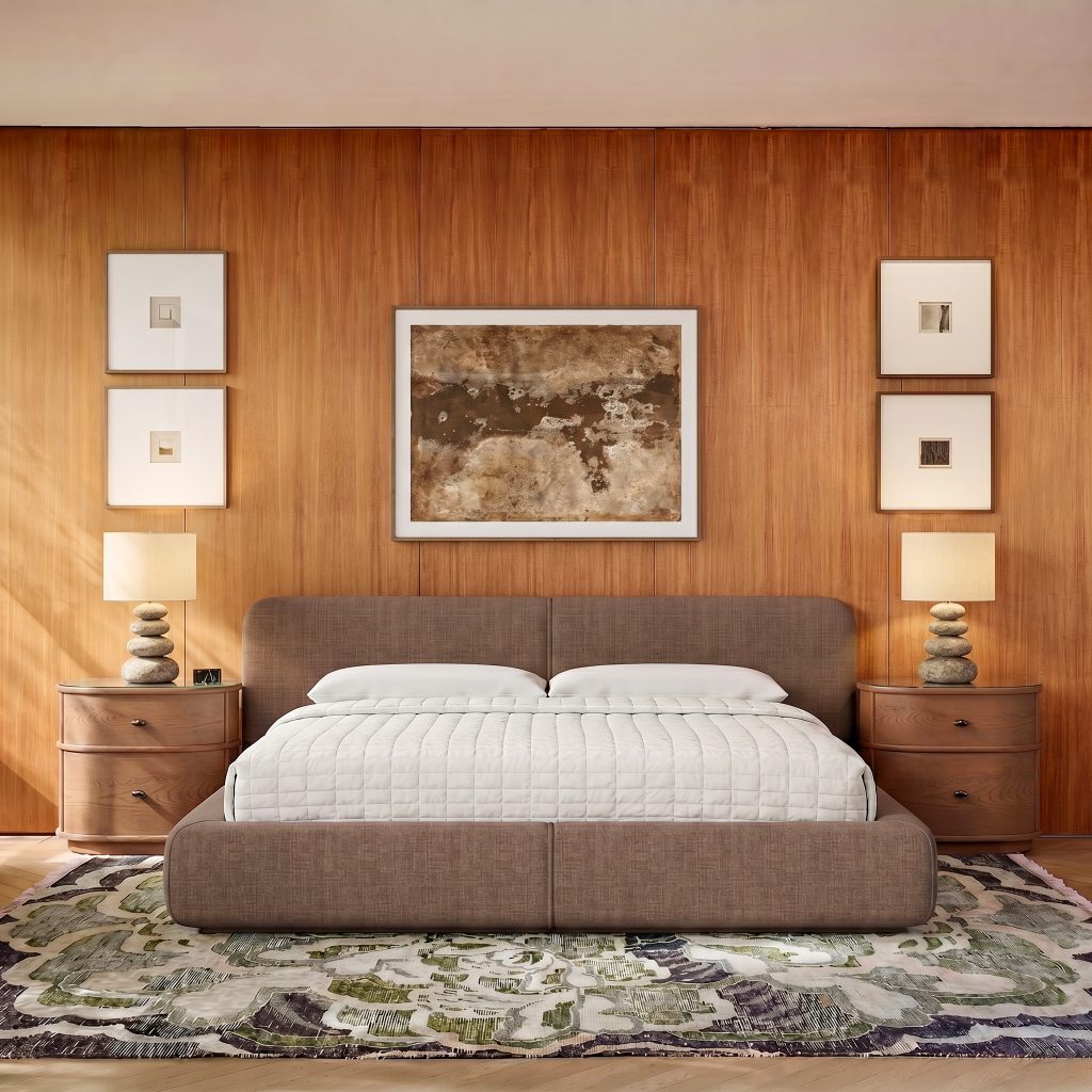
| Blush | The soft pink that follows the coral | Bedroom upholstery, sheer curtains, velvet headboards |
| Lavender | The final glow before twilight | Accent pillows, ceramic lamps, painted dressers |
| Soft Peach | The transition between coral and blush | Dining chairs, area rugs, ottomans |
| Golden Hour Yellow | The sun’s last rays reflecting on water | Accent tables, art frames, decorative objects |
The Feeling: Effortless Warmth
Furniture inspired by California sunset is not dramatic in the way autumn colors are. It is optimistic. It lifts the spirit without demanding a mood change. A coral sofa in a beach house, a blush velvet headboard in a primary bedroom, a lavender armchair by a window overlooking the garden — these pieces say: breathe. relax. stay a while.
Pairing Suggestions
Coral + Teal – A vibrant, unexpected contrast. Perfect for a coastal living room.
Blush + Gray – Soft, modern, and endlessly livable. Ideal for a primary bedroom.
Lavender + Cream – Gentle and romantic. Works beautifully in a reading nook or guest room.
Soft Peach + Natural Wood – Warm, organic, and inviting. A staple of California casual style.
Part Three: Bringing the Landscapes Home
The genius of American furniture color lies not in choosing one palette over the other, but in understanding how they can coexist — how the reflective depth of a New England autumn can ground the dreamy optimism of a California sunset.
A House Divided: Rooms for Different Moods
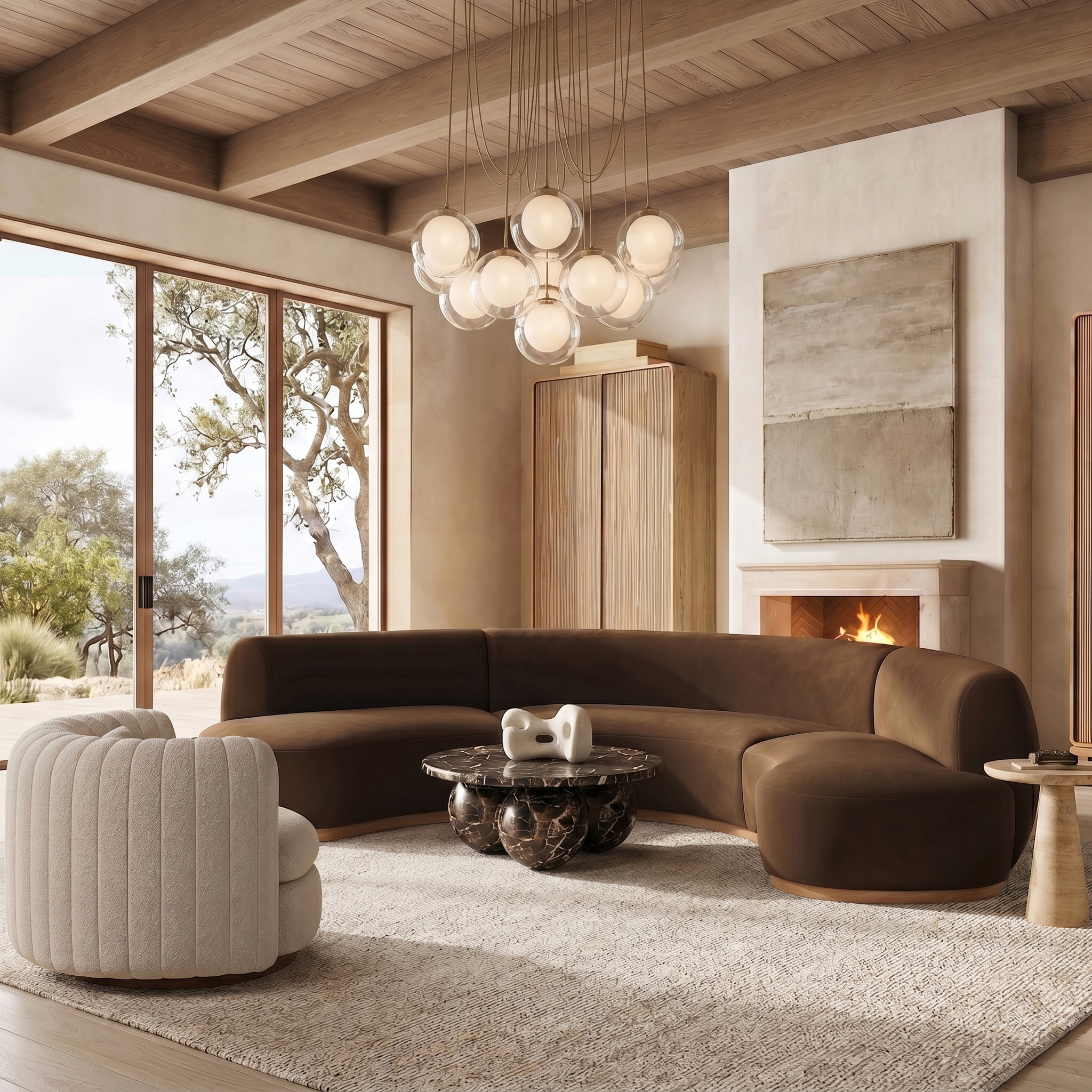
You do not need to choose. Let the entryway and living room reflect the warmth of California — coral sofas, blush pillows, golden-hour accents. Then, as you move toward the library, dining room, or primary bedroom, let the richness of New England take over — crimson armchairs, burnt orange throws, amber wood tones.
The Transitional Piece: Furniture That Bridges Both Worlds
Some furniture colors belong to both palettes. Terracotta — that earthy, reddish-brown — lives comfortably in a New England fall landscape and a California sunset. Warm cream serves as the neutral that lets both palettes breathe. Deep navy anchors the dreaminess of sunset while complementing the richness of autumn.
The Role of Texture
Color does not exist in a vacuum. On velvet, New England crimson feels opulent and warm. On linen, it feels relaxed and lived-in. On leather, California coral takes on a surprising sophistication. On performance fabric, it becomes poolside-perfect. The same color, in different textures, tells a different story.
Part Four: Year-Round Color Wisdom
The beauty of drawing inspiration from American landscapes is that these colors do not expire. They are not “spring” or “fall” in a limiting sense. They are moods.
For Year-Round Use
Use New England colors in rooms where you want focus and warmth — libraries, studies, dining rooms, primary bedrooms.
Use California colors in rooms where you want ease and optimism — living rooms, sunrooms, breakfast nooks, guest rooms.
Let natural light be your guide. North-facing rooms welcome the warmth of autumn palettes. South-facing rooms glow with sunset hues.
A Final Word: Color as Memory
When you choose a crimson sofa, you are not just choosing a color. You are choosing the memory of walking through a Vermont forest in October, the crunch of leaves underfoot, the crisp air on your cheeks. When you choose a coral armchair, you are choosing the memory of a Pacific Coast evening, the salt in the air, the sky on fire above the water.
American furniture color, at its best, is not decoration. It is evocation. It brings the outside in. It carries the vast, varied beauty of this country into the rooms where we live, eat, sleep, and gather.
From the maples of Vermont to the shores of Malibu. From autumn’s fire to sunset’s glow.
Shop the furniture